- Role
- Founding designer at Pixel & Tonic, joining when the team was three.
- Team
- Me (design and frontend), Brandon (CEO), and the engineers.
- Timeframe
- From Craft 2.5 (2015) to Craft 5 (2024).
- Shipped
- The vertical navigation, accessibility improvements, and a design system that brought consistency across versions.
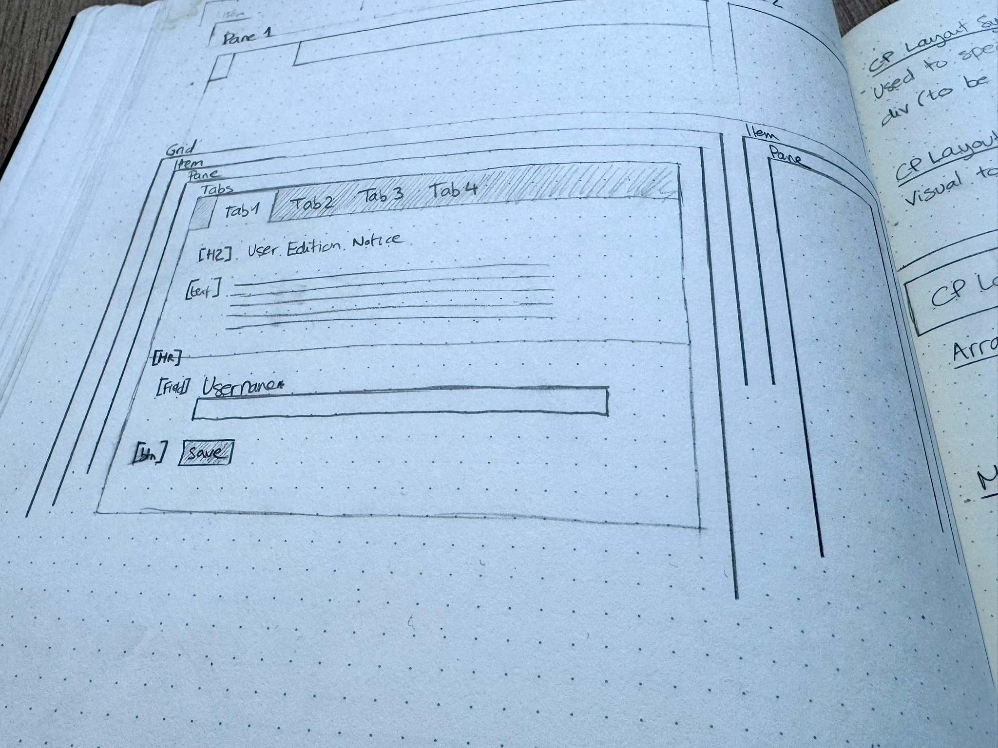
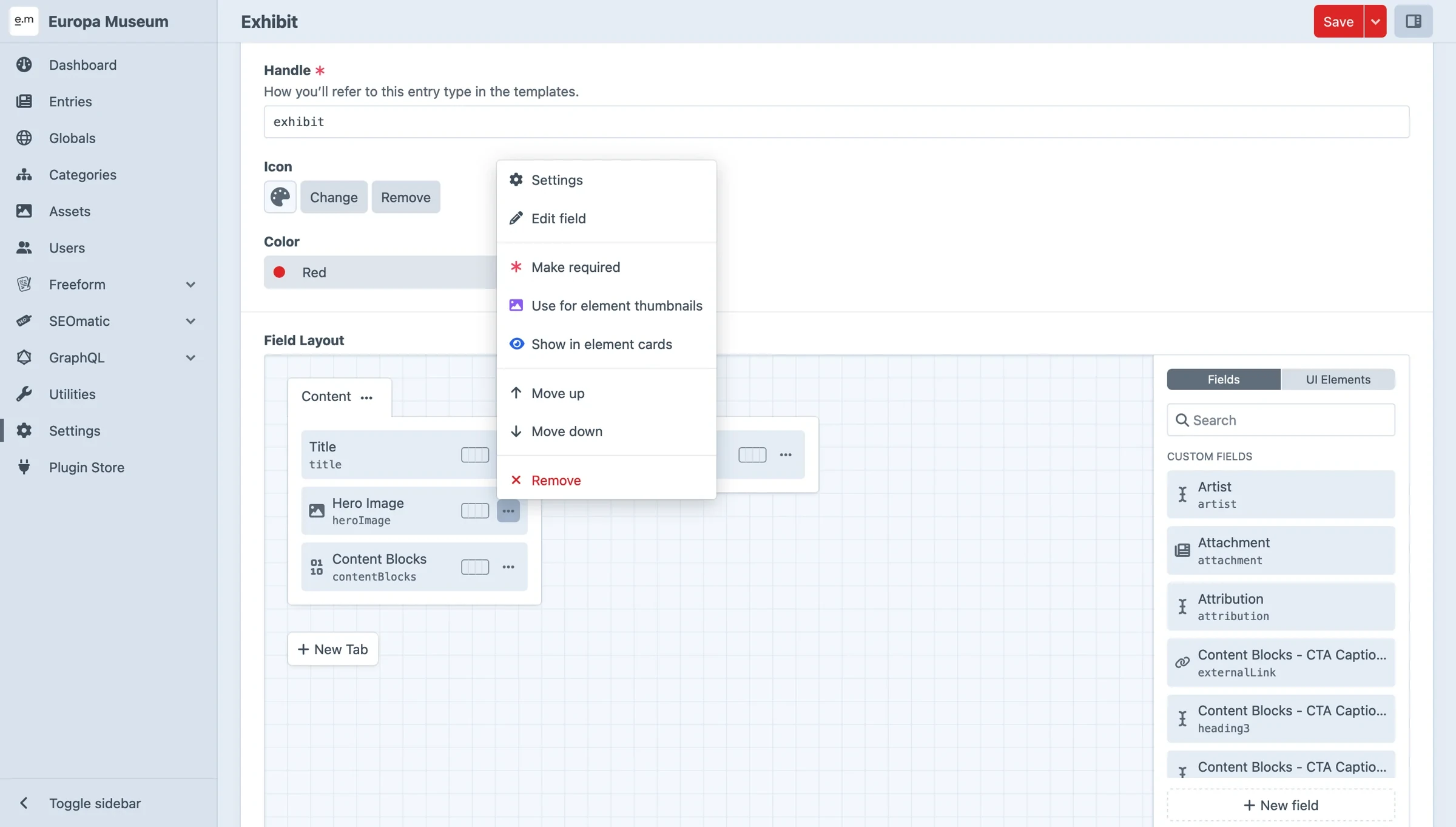
My journey started with ExpressionEngine around 2010, making websites and plugins, including Analytics, the plugin that got me invited to join Pixel & Tonic’s team of three to lead the design of Craft. Over the years I’ve worked on every major iteration of the control panel, from v2 to v5, alongside accessibility improvements and features like the Field Layout Designer, which is how content is modeled in Craft.

The challenge
Craft CMS serves two kinds of audiences: the developers who build sites and the authors who write content in them. Many developers also build plugins on top of it, which render inside the CMS and add their own items to its navigation. Over the years and across major versions, the challenge was to keep improving the UI’s consistency and accessibility, while making Craft a great platform to build upon, with the proper tools for plugin developers.
My role
I led the design of Craft CMS and did a lot of its frontend myself, CSS and JavaScript, plus Twig and PHP. I also had to design for the broader picture and keep it consistent across the whole platform: the CMS, craftcms.com, the docs and the products we built around it, like Craft Cloud and Craft Commerce. The design system had to work for developers outside the company too. Later we hired a designer/front-end engineer to help out with the website and the documentation, which gave me more time to design across the platform and products.
Why the navigation went vertical
In Craft 2.5, in 2015, as part of a full redesign of Craft CMS, we moved its navigation from a horizontal bar to a vertical sidebar. At the time, it was kind of a big deal. I mocked it up and built it, but what settled it was that plugins can add their own items to the navigation, and a horizontal bar gets crowded very quickly. It wasn’t just following a trend and solved a concrete issue people had.
Craft’s own items Items added by plugins
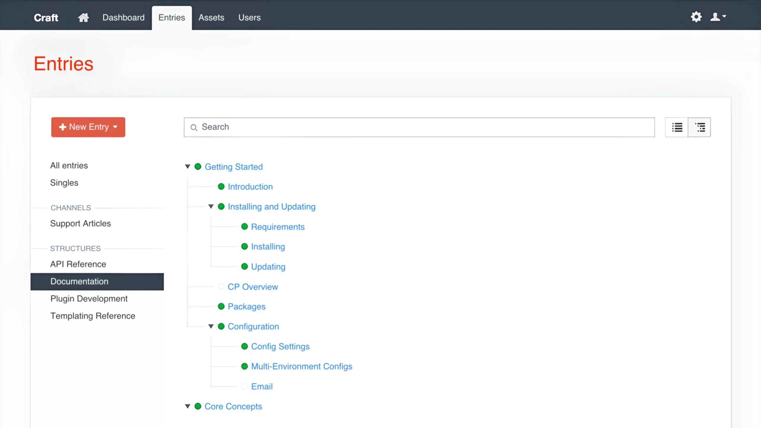
Craft 1 (2013)
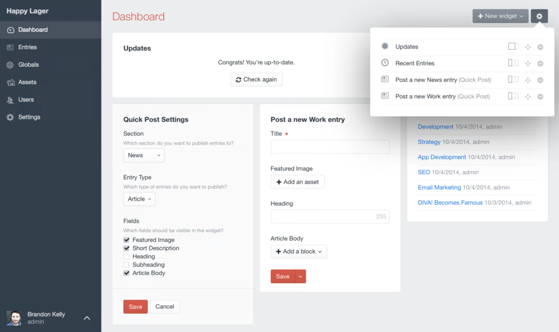
Craft 2.5 (2015)
Accessibility, release after release
We were happy with the look and feel of Craft CMS, and we cared about accessibility, but blind users’ feedback showed us gaps, and the work we were doing wasn’t completely solving their issues. In 2020, we doubled down on accessibility and hired an accessibility expert. It resulted in a lot of adjustments that made the UI uglier than it was before, with more contrast and extra visual cues. Craft is a big product, so the fixes went in progressively, and for a while the UI lost its visual consistency.
The tension
We wanted those accessibility improvements now, but fixing things cleanly would have meant bringing the whole system along, and that wouldn’t have been ready before the next major version. So we put accessibility ahead of visual consistency, and I accepted that the UI would look less consistent for a while. Sometimes you can’t have everything perfect, because things move at different speeds.
Impact
The vertical sidebar is still how Craft CMS works in Craft 5. After the accessibility push, we dedicated more time to refining the design and brought the consistency back across versions, while keeping the accessibility improvements. With blind users’ feedback and the expert’s audit, we worked toward full keyboard and screen reader support and got as close to WCAG AA as we could. Craft 4 shipped in 2022 with much better accessibility for authors.
Craft 2.5 (2015)
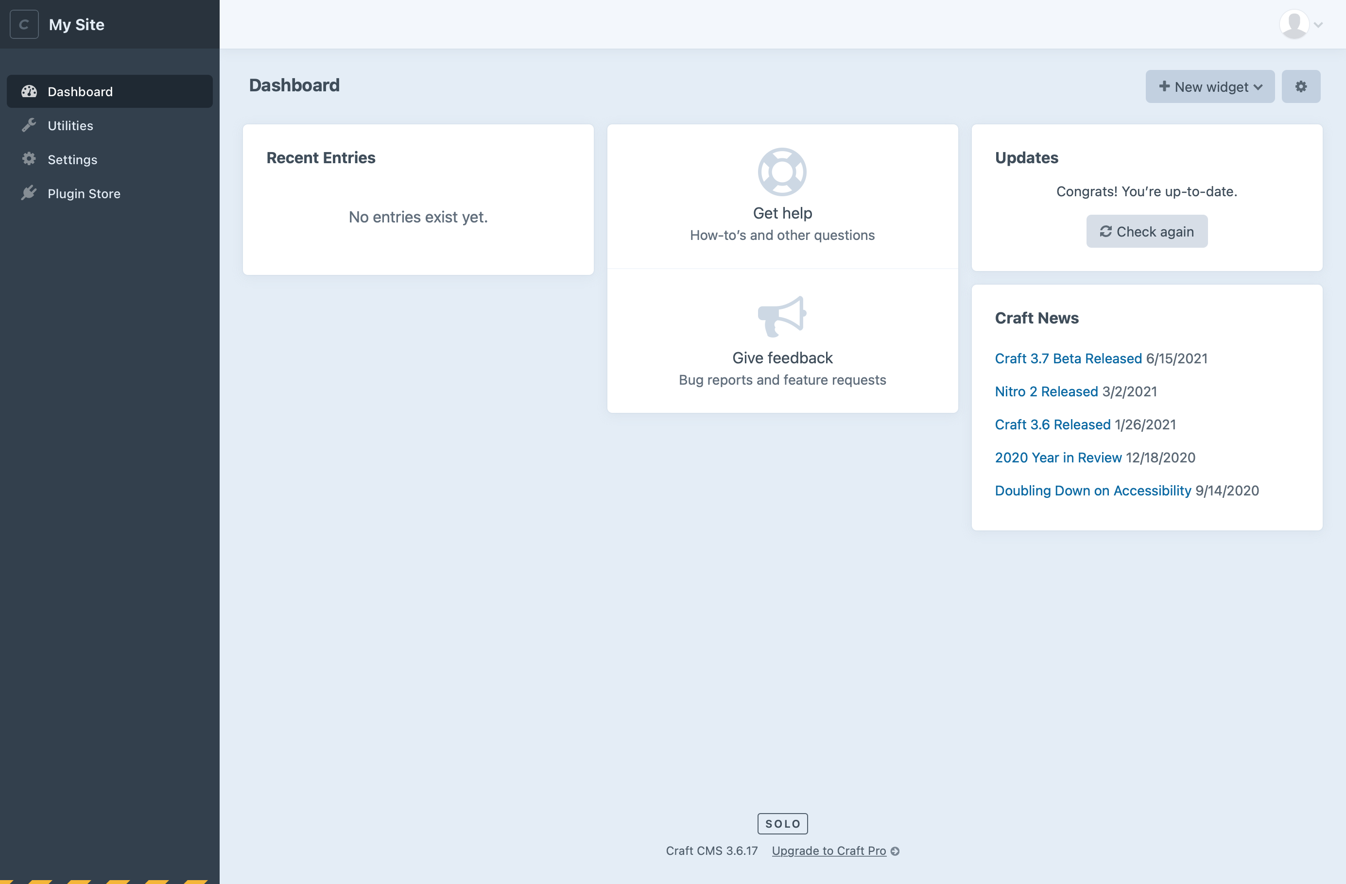
Craft 3 (2018)
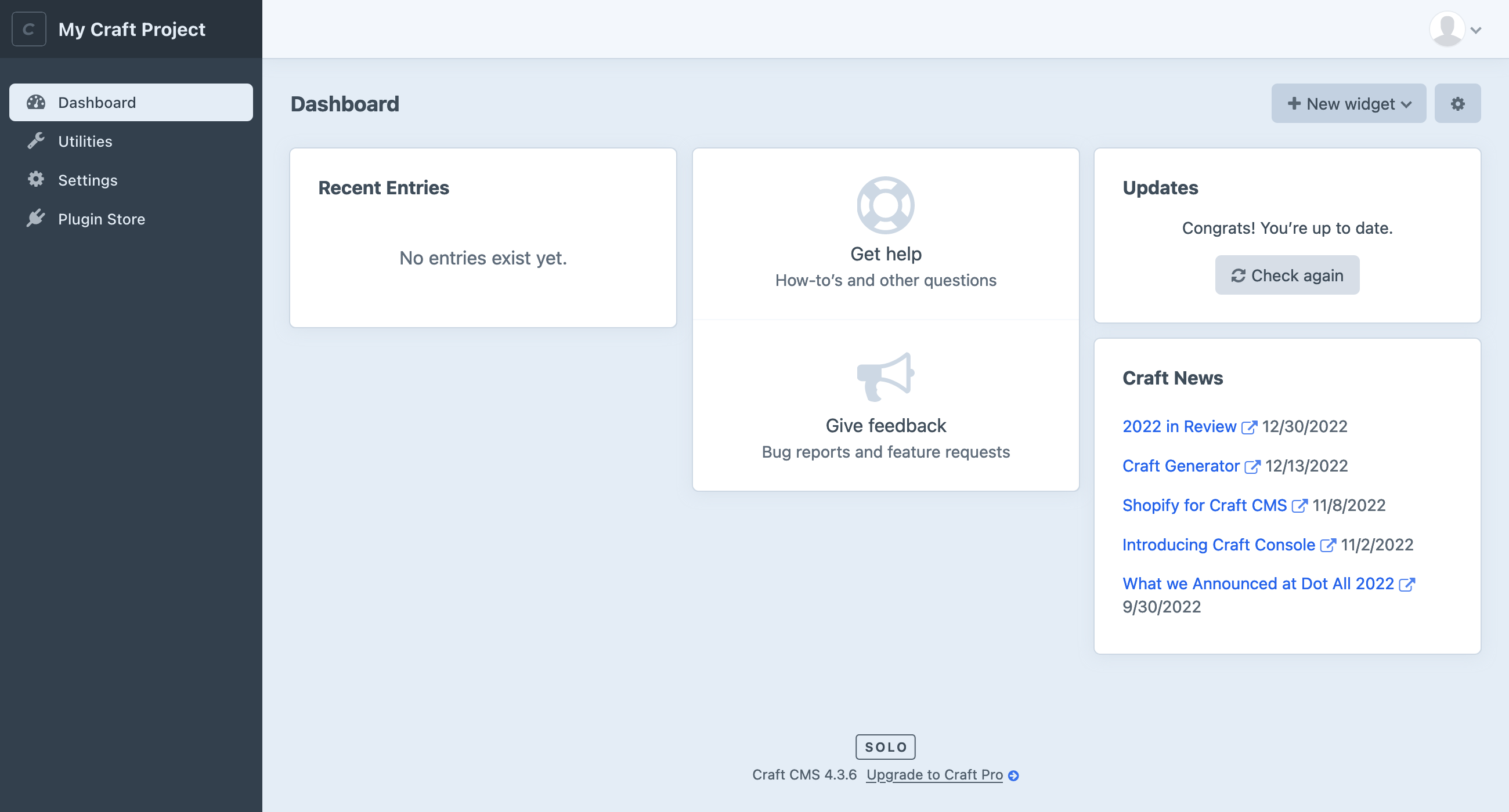
Craft 4 (2022)
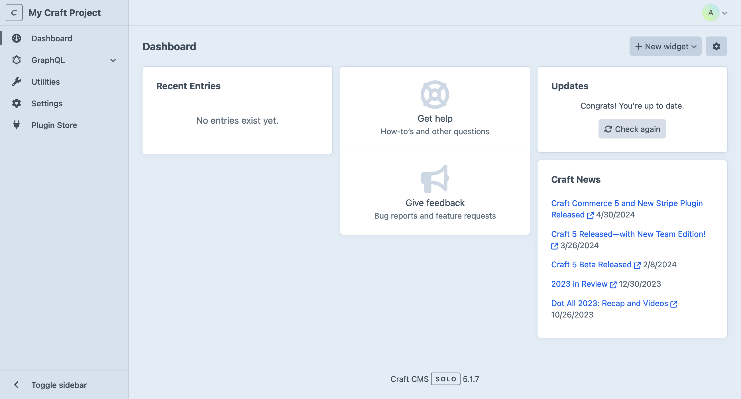
Craft 5 (2024)
What I learned
We cared about accessibility early, but for years we fixed things as feedback came in. Accessibility belongs in the design system from the start, so that every screen, and every plugin built on it, inherits it. In a product as big as Craft, improving it step by step is what cost us that consistency for a while.